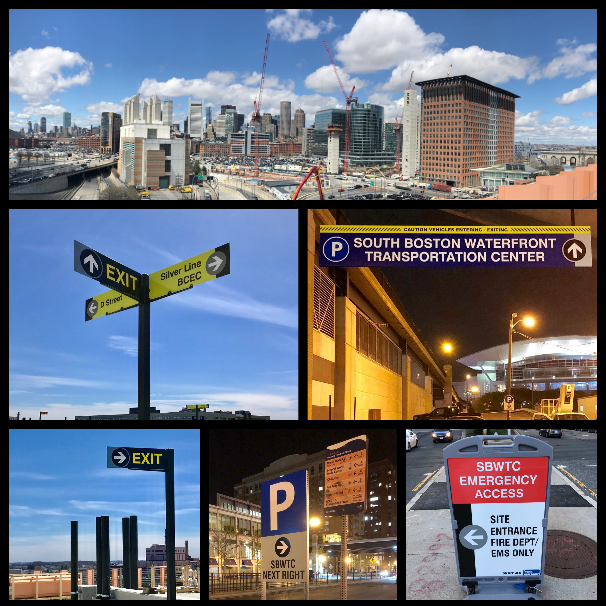
World on the Move: Approaches to Transportation Hub Signage and Wayfinding
Exterior Signage, Interior Signage, New England Signs, Others, Sign Design, WayfindingJ.R.R. Tolkien said, “Not all those who wander are lost.”
But in general, travelers prefer to know where they’re going. Whether an environment’s familiar or not, well designed signage helps ensure that only those who want to wander are free to do so — and everyone else can successfully find their way without getting lost.
Wayfinding, or directional, signs serve four main purposes:
- Pointing people where they need to go.
- Identifying landmarks (rooms, concourses, wings, and other important features).
- Informing people about regulations and instructions a space requires them to follow.
- Defining the space, because transportation hubs are large, open spaces, and wayfinding branding helps define and bring consistency to the property.
As with wayfinding signs used in other facilities like hospitals or on college or business campuses to help visitors navigate efficiently and easily to their destinations, wayfinding in transportation hubs must also incorporate an environment’s interior design style, brand tone, and voice.
Transportation hubs have their own unique needs. For example, airports, bus, subway, and train stations need electronic signs to provide instant updates in real-time for travelers. Each specific hub has its own sign convention, format, and design. International hubs, for example, rely more heavily on pictograms to communicate information to travelers who may not speak the local language.
Ultimately — as with any business or location — their wayfinding signs must convey information clearly and concisely and be accessible to everyone. When executed efficiently, signage used in airports, train stations, and bus stations makes transportation usable for all and enables everyone to access the transportation system.
Generally speaking, following ADA standards, transit signage design should take the following factors into consideration to insure accessibility to all.
The right number
A hub needs enough signs. There’s nothing more frustrating than searching for signs to verify you’re going the right way, not finding any to provide guidance, and discovering you’re not where you needed to go. Some transit areas err on the side of too little signage, a far more frequent issue than having too many signs.
Placement and lighting
Signs must be properly placed and lit. Poorly located and badly lit signs are difficult for everyone to read. Imagine the challenges faced by someone in a wheelchair trying to read a sign hanging too high, or someone with visual impairment struggling to read information on a sign that’s too dark.
Fonts, Color & Contrasts
Sign text should use straight-line, sans-serif fonts. They’re easier to read for people with dyslexia or vision disabilities. The most effective, accessible fonts include Arial Daytona, Helvetica, Tahoma, and Trebuchet MS. Some colors work better than others. The best signs use colors that provide a good contrast from their surroundings. The text and sign colors also need to contrast from each other. A 4.5:1 ratio is ideal — darker colors should absorb 4 ½ times more light than lighter colors.
Strategically designed signage can also help reinforce branding and enhance a facility’s aesthetic, increase comfort levels, and create a welcoming experience for everyone.
Electronic Message Centers
Perhaps nowhere else is it critical that people have access to updated information in real-time. Electronic message boards displaying arrivals and departures should have clear, contrasting, sans-serif fonts large enough for easy reading from up to 30 feet (or more) away.
By Plane, By Train, By Automobile
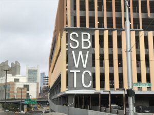
The sign for the South Boston Waterfront Transportation Center
Regardless of how you’re traveling — whether by plane, train, or automobile — signs make the journey easier and less stressful (and parking, finding exits, locating bathrooms, making that next connection) easier.
MBTA
The Massachusetts Bay Transportation Authority oversees almost 400 miles of track connecting 141 different stations within Metro Boston. Over 120,000 people ride these trains every day.
Metro has also designed and installed signs for:
- Downtown Crossing, Boston, MA
- Salem Depot, Salem, MA
- North Station, Boston, MA
- Beverly Depot, Beverly, MA
Logan Express
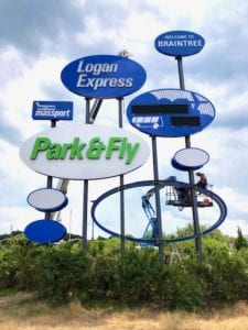
The soaring sign for Massaport Logan Express
In early 2020, Metro updated the Massport Sign at the Braintree Split, where Interstate 93, U.S. Route 1, and U.S. Route 3 converge. The commuter parking lot for Boston’s Logan International Airport needed a new sign to replace the old, rusted sign.
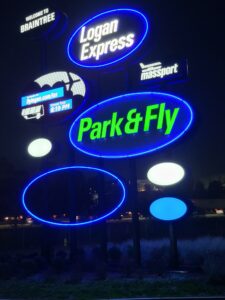
Logan Express Park and fly sign at night
Easily visible from the highways, its nine new double-sided oval signs—which soar 50 feet into the sky—use distinct, contrasting blue, white and green colors. It includes an electronic message center (EMC) sign connected directly into the Massport system to provide real-time updates on airplane departures and arrivals.
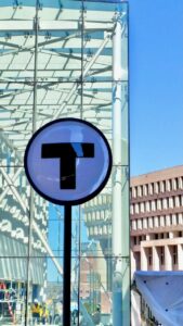
An MBTA sign outside the Government Center station in Boston, MA
Miles to Go Before I Sleep
Effective directional and wayfinding signs make parking lots, train and subway stations, and airports more accessible and easier to navigate. For people with miles to go before they sleep, that’s the most important thing of all.
