Exterior Signage
- Award-Winning Projects
Cost-Effective Guideposts For Your Business
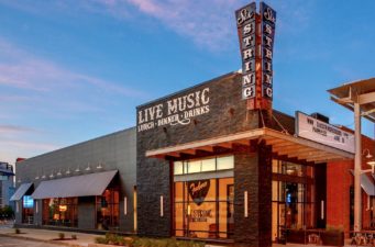
Although we’re moving more and more to a world of digital advertising, creatively designed exterior signage offers many benefits. Effectively branded outdoor signage catches the eye, draws in traffic, enhances the brand and so much more.
Creative, visually-appealing and attractive outdoor signs can help your business stand apart from the competition. An important marketing strategy for companies, exterior and outdoor signs can double as advertising to drive sales. Outdoor signs:
- Shines attention on your company
- Spark and hold interest
- Claim a location and help businesses identify themselves
- Assist with wayfinding
- Reach a broad, local audience
Outdoor signs also increase your ROI. In fact, according to the Sign Research Foundation, 60% of businesses realize revenue increases of 10% or more after installing their signs. To help you calculate what you should invest in your signage, visit our ROI calculator. You’ll be able to:
- Compare your sign project to other investments
- Compare your sign project to other forms of advertising
- See the results for both analyses, which will help you decide how much to spend on your new or upgraded signage
Types of Outdoor Signs
The style and type of outdoor signs is — at the outset — a bit overwhelming to consider! Metro Sign makes the process a little simpler by working with you to define your needs and help you select the best outdoor sign for your goals and budget.
Here are just a few of the exterior signs we design, manufacture, and install at Metro:
- Illuminated Sign Cabinet/ Box Signs: LED or fluorescent lamps usually illuminate these extrusion cabinets. We can fabricate them to any size and offer upgrades like routed or push-through graphics.
- Hanging Signs: Manufactured from aluminum, acrylic, or high-density urethane, these signs are fully customizable. We can mount these signs to the underside of a canopy or building soffit.
- Pan Signs: These fabricated aluminum or ACM signs offer a lower-cost alternative to sign cabinets. Pan signs are either non-illuminated or lit by external light fixtures.
- Blade or Projection Signs: We mount these projecting signs on building facades, poles, and other surfaces perpendicular to the sign and traffic flow. See examples.
- Face-Lit Channel Letters: These customized metal or plastic 3D letters apply directly to wall surfaces or monuments. Typically illuminated with LED, we also offer a clear-faced option lit with neon or a flexi LED product (faux neon). See examples.
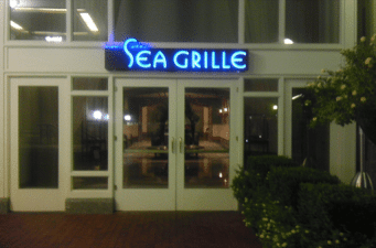
- Halo Lit Channel Letters: Also known as reverse-lit or backlit letters, we mount them 1 ½ inches away from the wall to achieve the halo effect from behind the sign. Upscale in appearance and a preferred type by municipalities concerned about sign lumens, these signs direct the light back toward the building rather than the face to eliminate light pollution. See examples.
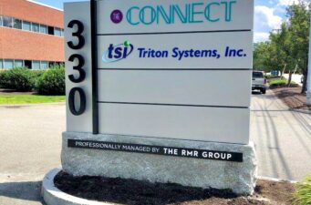
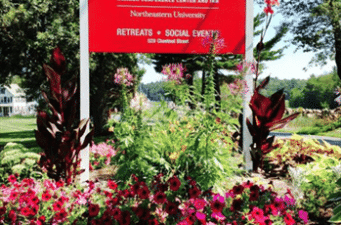
- Monument Signs: This low profile ground sign works well for wayfinding and as a property beacon. Many diverse materials can comprise the sign itself; common base materials include aluminum, stone, brick, or faux masonry that utilizes EPS (expanded polystyrene). See examples.
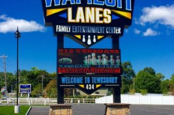
- Pylon Signs: One or two poles support these double- or single-sided signs often made from aluminum or steel. LED or fluorescent lamps can illuminate their rigid or flexible faces. These usually freestanding signs stand 8 feet tall or more and can also incorporate an electronic message center (EMC) to provide additional marketing, branding, and information. See examples.
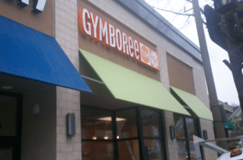
- Commercial Awnings/ Canopies: Fixed or retractable awnings cover business storefronts and entrances or shade windows. Canopies offer definition and branding identification while protecting patrons from the elements. See examples.
The Metro Process
A large component of investing wisely in outdoor signage is ensuring that you choose the right sign for your business. Metro Sign recognizes the potential expense, and we’re committed to help you understand and calculate your ROI. We also understand that you’re committing to a multi-year investment, and we want to make sure that the sign we design and install is the one that best fits your needs — and doesn’t break your budget. Obsessed with quality and good service, we also believe in value engineering.
Strategies for Sign Styles
Depending on your sign’s location, it may have a slightly different strategy.
- Sidewalk, entrance, awnings, window signs: These signs should be visible without disrupting the flow of foot traffic. They should express the type of experience your customers expect and direct readers to your business’s entrance.
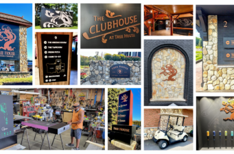
- Informational signs (directional, departmental, organizational, wayfinding) signs: The number one goal of these signs? To help people navigate more easily. Their large, bold fonts should embrace messaging that’s short, simple, and to the point.
- Accessibility signs: These code-compliant signs, often located near parking and building entrances and exits, should include tactile (Braille) fonts. Mounted between 40 and 60 inches from the ground, Braille signs must be installed within easy arms reach.
Tips for Choosing the Right Sign
When you’re ready to start your sign project, we work with you to design and choose the right sign. We generally recommend keeping signs simple to avoid clutter and avoiding complicated messages or graphics. We’ve also found that larger signs are usually better.
Our other recommendations include:
- Choosing high contrast colors and text
- Opting for short messages
- Allowing messaging, branding, and other design elements to determine whether or not to include a border
- Stating the benefit to the customer
- Using the second person (you/ your/ yours)
- Providing context when possible
- Singing your own praises when relevant
- Choosing memorable and creative options
- Following industry signage formula (headline, explanatory text, and a call to action) and local building code regulations
Contact Us
For More Information About Exterior Signs:
Recent Blog Posts
Copyright 2022 MetroSign and Awning, All rights reserved | Privacy Statement | Terms of Use
