Hidden Messages In Signage
Architectural Signage, Design/Build, Exterior Signage, Others, Sign Design, Signage TipsWendy’s has a new logo, but it contains a hidden message that’s very old. Can you spot it? … It’s the word “mom” woven into the red-headed girl’s collar. I guess the idea is to evoke home-cooked foods, family dinners, and perhaps even a dose of unconditional love. None of that is guaranteed when you’re eating at a Wendy’s restaurant, of course. But the addition of “mom” to the company’s logo helps convey that message, if only subliminally.
FedEx is an extremely successful company, having changed the way people do business and created opportunities that didn’t exist until FedEx made them possible. So it’s fair to wonder: Did the hidden message shown here have anything to do with the company’s success? Hard to say. But it’s neat that they tucked a strong but hidden “arrow” shape into the space between the “E” and the “x”.
Here’s the logo of the Milwaukee Brewers. At first glance, it’s a simple baseball mitt. But look again and you notice the letter “m” and the letter “b” actually forming the overall graphic. What’s the hidden message here? I’m not sure, but with all parts of the logo working together you can discern both the team’s name and its sport at a single glance. At a minimum, that’s great efficiency.
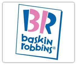
I always wondered why so many people called these stores “31 Flavors,” until a friend pointed out to me the hidden message. Now it’s so obvious that I can actually admire the company having two names and finding a way to work them both into its logo.
Whether or not you like college football, you have to admire the way The Big Ten Conference worked into its logo the number of schools in that association. For a while there were 11 colleges playing against each other. Now there are ten. During each of the two periods, the Conference’s logo fully reflected both its name and its membership count in a very graphical way.
In addition to being a beautiful graphic, this logo conveys a sense of urban history and civic growth, all at the same time. How? Because each of the colored shapes turns out to be the outline of a map of London, each one reflecting an important period in that city’s history. Sure, this complex message requires a bit of explanation. But once you know the story, the message becomes extremely vivid and memorable.
Utilizing the old “field/ground” trick, the Pittsburgh Zoo has integrated the faces of a gorilla and lion with the silhouette of a tree to create a memorable logo. Many times, you have to look twice to be able to distinguish the field from the ground, and vice versa. In this logo, that’s quite easy.
Here’s another “field/ground” effort. This time, however, it’s more subtle and emotional. At first glance, you see the continent of Africa. Then as you look deeper, you see the silhouettes of an adult and a child, evoking both compassion and hope.
Isn’t signage a great way a communicate?
If you’ve seen any signs you love, or would like us to create one for you, please give us a call to talk about it at 978-851-2424.

