A New Look for Worcester Cultural Coalition’s JMAC Popup and BrickBox Theater
Architectural Signage, Community, Customer Spotlight, Design/Build, Exterior Signage, Sign DesignWorcester’s Cultural Coalition Popup’s mission is simple: to support active creative engagement and foster a strong cultural identity for Greater Worcester. The Jean McDonough Arts Center offers space for local and visiting artists, organizations, and creatives to produce art shows, open mics, classes, and much more.
In 2019, philanthropist Jean McDonough donated $2 million to support the completion of the BrickBox Theater, one of the Worcester Cultural Coalition programs. To honor her gift, the Coalition teamed with a local graphic designer, Travis Duda of Hunchback Graphics, to create a new logo.
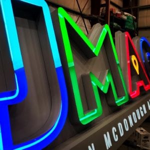
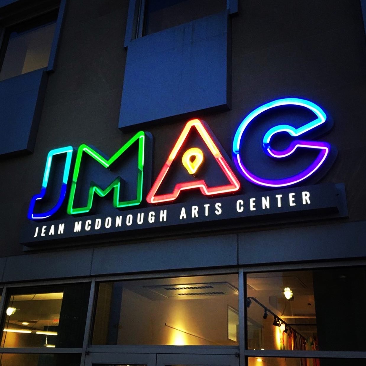
Incorporating the colors of the “Worcester Cube,” the JMAC sign embraces bright neon and pop art aesthetics to welcome everyone who visits the permanent popup, part of a public-private partnership established over 20 years ago between twelve cultural organizations and the city of Worcester.
A Bright Retro Idea
Metro Sign and Awning owner and vice president of marketing, Tom Dunn, says, “The organization sought bids on the new sign project and when we submitted, I had a feeling they wanted to work with us early on because of our approach. There were no defined specs except that they wanted the sign to be neon.”
“Its design was inspired by a local Philanthropist, Jean McDonnough — they refer to her as JMac — and the leadership wanted to create a sign that honored her and her commitment to the program. We proposed an initial concept design and value engineered it to make sure it was high-quality and within their budget.”
While most companies have moved away from neon because it’s made of glass and can break, and is costly to repair, even the most state-of-the-art LED can’t duplicate its appearance. The Coalition wanted an old-time nostalgic look that only neon can achieve.
“It was nice to work with,” Dunn says, “because it does carry that old fashioned flair. And even though most businesses have gone to LED or faux neon via LED, we’ve seen more neon signs this year than in the past decade.”

Always Adapting
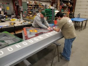
During development, Metro Sign learned the landlord had expressed concern about the number of penetrations necessary to safely mount and wire the sign. The Metro team recommended setting the sign on a cabinet which could store all the electric elements. This approach eliminated the need to drill an electrical hole in the wall for each letter.
Metro’s very own Johnny Mac — John McNally — led the team to build a form backer behind the letters to reduce the number of holes but still provide the necessary support.
A Colorful Beacon
The Coalition’s members love the new sign. “They were thrilled, thankful, and so happy,” Dunn says. “They were easy to work with, and we enjoyed the challenge of delivering a sign that celebrates the Coalition’s mission: to promote cultural equity, community engagement, collaborative co-working, and creative entrepreneurship.”


